Mural Making

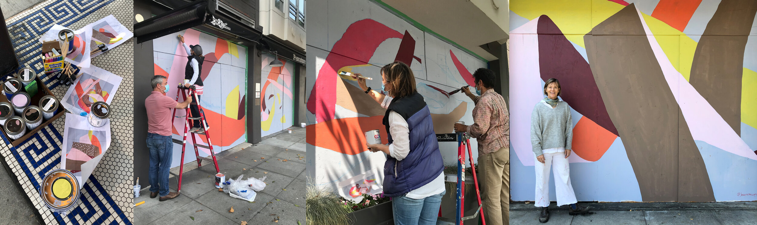
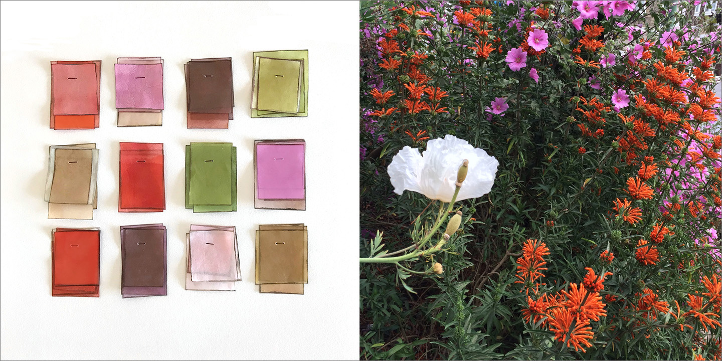
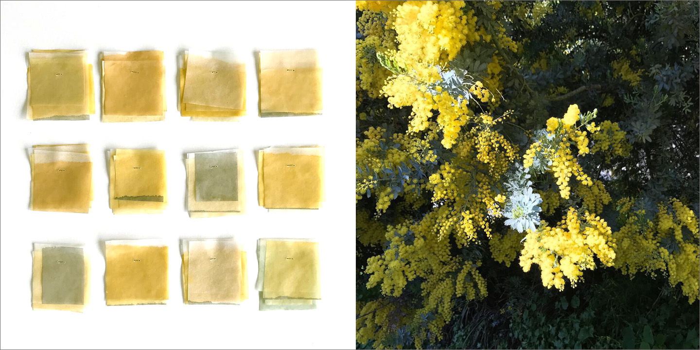
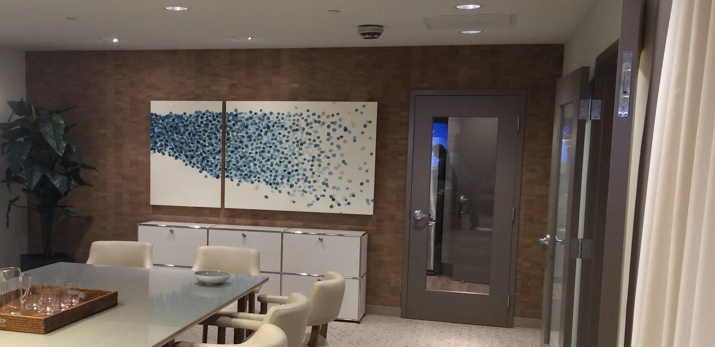
I just finished the Meanderings Murals for Hotel Zoe! I have help other artist on their murals but this was the first time I created my own with a lot of help from my family and friends! The Meanderings murals are a series of 10 panels designed to bring some levity to the streetscapes of the city during shelter-in-place. Inspired by the photographic still lives making up the Meanderings series, the panels evoke fluid movement and a light, uncomplicated joy. Each panel is different, but all the panels are related: they take the viewer on a meandering path from one panel to the next. The colors depict the seasonal transition from summer to fall, and are inspired by fallen petals and leaves on my street in Bernal Heights (Swatch Series) with the addition of a bright chartreuse color derived from lichen on boulders and trees seen on a recent trip to the Emigrant Wilderness: a fitting metaphor for the resilience of life amid the current challenges we are all facing.

MeanderingsMural1_Blog.jpg

Studio Meditation

The Threadline Series is inspired by seemingly insignificant visual observations made in my studio environment, in nature and on neighborhood walks – insignificant but (to me at least) visually arresting: left-over loops of thread lying randomly about; a crisp white line in a dark gray rock; looms, stitching patterns in fabric; blades of grasses shooting out of a crack in a concrete sidewalk; a white chalk line on a slate blackboard; the play of light-on-metal in a box of freshly opened x-acto blades, textures and patterns found in nature.

In each case, I am attracted by the interaction of line and plane, softness and hardness, regular against irregular, of the organic against the inorganic. This interaction of opposites intrinsically occurs in the way I approach the encaustic medium – my tools are a sharp steel blade and a soft plane of wax. I engage the one with the other in a methodical, meditative and rhythmic manner. I’m borrowing techniques from printmaking (dry point). I like to work either in silence or with repetitive music with the studio lights off - only natural light is used in the creation of this series, both for the stillness it creates and because it helps to reveal the subtle lines and marks as I work the surface with my blade. It calms me and takes me away from the unstable climate of our present world.  

Painting with Paper

The Meanderings are a photographic still life series created with interwoven mulberry painted paper strips. They are a quiet, simple and spontaneous celebration of paper, color and light. They are my attempt to paint with paper and to demonstrate its capacity to be both fragile and solid. I’m intrigued by how the paper catches and reflects natural light. The diptych format creates a pause in the flow like taking a breath and adds a bit of tension between the two disparate halves that come together to make up a unified whole.

Meanderings.jpg

Fresh Pack of Blades

There is nothing quite like opening a fresh pack of xacto blades. I love the 100 lines, the repetition, the way the light glows off the sharp edges as well as the paper that is wrapped around them. There is also something about the anticipation of projects ahead of me and the feeling of a fresh start. It is my favorite tool (since my graphic design days) and my attraction to this object is so strong that I have started a new series titled Mnemonic in which that is the sole inspiration.

New X-acto blades                                                   Detail                                                            Mnemonic 1

New X-acto blades Detail Mnemonic 1

Harvesting Color

“Harvesting color” is reminiscent of cut flowers left hanging on a wall to dry. The strips of color evoke the visual bounty of Spring, and represents an attempt at capturing fleeting colors in order to preserve them for future use. This is my first installation and it’s currently being exhibited at Jen Tough Gallery until May 30th.

Harvesting Color.jpg
Harvesting Color_web.jpg

Mood Board series

The Mood Board series explores the relationships between colors and the emotional overtones of color combinations. Reminiscent of how a textile or graphic designer might choose an accent color to complement or contrast a color field.

“One who knows how to appreciate color relationships, the influence of one color with another, their contrasts and dissonances, is promised an infinite variety of images.” –Sonia Delaunay

Mood Board Series 1-12

Mood Board Series 1-12

Swatch Series

The swatches represent a non-pictorial way of documenting the changing seasons of San Francisco. In the same way that 19th century entymologists were compelled to collect insect and butterfly specimens for display, the swatches represent an urge to collect, juxtapose and display the evolving colors of the City. They are reminiscent of Pantone swatches, an ubiquitous feature of my prior life as a Graphic Designer. Created in the studio rather than in the immediacy of plein-air, the swatches represent memories and impressions rather than actual colors. And unlike Pantone's opaque color rectangles, the swatches are transparent, allowing the creation of depth through layering, to better express the imprecision of memories.

Garden Swatches

Garden Swatches

Golden Mimosa Swatches

Golden Mimosa Swatches

FOG+FIRE

This series of works is inspired by two cyclical phenomena that have greatly influenced the Northern California landscape: fog and fire. Both fog and fire obliterate, turning scenery and nature into whiteness and light. Familiar shapes return when the fog dissipates; fire however leaves behind an eerily tragic, beautiful, charred landscape. Fog creates a comforting, quiet, contemplative solitude – a cocoon around us, encouraging thought and contemplation. The aftermath of fire creates similar conditions, with charred remnants awaiting future rebirth. Whereas fog and fire might seem to be opposites, the works strive to explore a quality that they hold in common: their role as generative and regenerative agents in the cycle of nature. In a reversal of commonly accepted representations, white suggests oblivion, and black suggests rebirth.

Ferguson Fire, Sketchbook, Bernal Hill Fog, Encaustic and Oil Test Panel

Ferguson Fire, Sketchbook, Bernal Hill Fog, Encaustic and Oil Test Panel

Black Smoke Rising, Golden Embers, Ferguson Fire Swatches

Black Smoke Rising, Golden Embers, Ferguson Fire Swatches

Arc FourSquared Exhibit – EcHo 1-16

My work seems to evolve in a cyclical rather than a linear form – as I explore new directions, I will circle back to previous expressions and reinterpret them based on more recent pieces. This is due to a number of factors: I tend to investigate multiple interests at the same time, and will develop one particular direction before revisiting another one; I also like to let ideas and images marinate in my brain and my body, and find that they subsequently emerge as different forms of mark-making. As a result, FourSquared is an opportunity to directly juxtapose the different visual manifestations of the things that inspire me, with the grouping of the sixteen pieces acting as a visual snapshot of the different directions I continue to explore.

FourSquared_LR copy.jpg

Discarded Beauty

I’m attracted to mundane and discarded everyday materials. In this case netted bags (whether for laundry or oranges) have been a recurring obsession, and I love losing myself in the process of drawing the tangle of lines. The subtle distortions of the warp and weft create evocative forms, transforming a utilitarian object into something worthy of contemplation. I’m also inspired by deconstruction and unraveling.and tried to incorporate those concepts into my drawing.

Ordinary_final_WEB.jpg

When Opposites Interact

My current area of exploration is inspired by seemingly insignificant visual observations made in my studio environment and on neighborhood walks – insignificant but (to me at least) visually arresting: left-over loops of thread lying randomly about; a crisp white line in a dark gray rock; stitching patterns in fabric; blades of grasses shooting out of a crack in a concrete sidewalk; a white chalk line on a slate blackboard; the play of light-on-metal in a box of freshly opened x-acto blades.

In each case, I am attracted by the interaction of line and plane, softness and hardness, of regular against irregular, of the organic against the inorganic. This interaction of opposites intrinsically occurs in the way I approach the encaustic medium – my tools are a sharp steel blade and a soft plane of wax. I engage the one with the other in a methodical, meditative and rhythmic manner. I like to work in complete silence with the studio lights off - only low afternoon natural light was used in the creation of this series, both for the stillness it creates and because it helps to reveal the subtle lines and marks as I work the surface with my blade.  It calms me and takes me away from the frenetic and chaotic climate of our present world.

Sidewalk outside my front door                             Studio door stop                             &nbsp…

Sidewalk outside my front door                             Studio door stop                                      Fresh X-Actos

Threadline Series                                          

Threadline Series                                          

Photographic Series

This photographic series was borne out of a desire to document the process of creating fragile and impermanent works. 

Sheets of japanese mulberry paper are cut, painted, formed and folded.  Repetitive shapes are combined and superimposed to create evanescent assemblages that can only endure in photographic form.

What started as documenting the process of making becomes an end in itself, capturing moments in time that evoke imagery from nature - fallen leaves, pebbles, water, ice and snow.  Shot using natural light, the photographs echo the meditative and repetitive spirit of the original work

Photographic Series 4.jpg

Paper Petals

I have been obsessed and inspired by eucalyptus leaves ever since I moved to San Francisco over 20 years ago. I love the color (of decaying leaves), the smell and shape. I’m constantly taking photos of the fallen leaves and my recent paper petal series was inspired by these piles of leaves and fallen petals. 

Inspiration                                                                    …

Inspiration                                                                         Application

Shibui

I've been playing around with a new series that I'm titling Shibui. This Japanese word refers to a particular aesthetic of simple, subtle and unobtrusive beauty. These pieces are created with paper, light and shadow (sometimes watercolor). I'm trying to capture a quiet and austere feeling. I work on these images at the same time I’m working on another series that is laborious and very detailed. These pieces give me a break and they are quick/spontaneous to create. I rely on the natural light that comes into my studio in the afternoon. I sometimes use scrap mulberry paper that I have been painting on. They can not be labored on or fussed with - they either happen quickly or they do not work. To labor on them would kill their quiet and simple energy.

Shibui 6                                                                     &n…

Shibui 6                                                                                             Shibui 1

LOOKING LIKE LISTENING IS A LOST ART

I recently saw the Agnes Martin show at the Guggenheim, the ideal place to see her work, and it was the best remedy for this heart breaking time. Somehow I became cleansed of anger and distractions. There are a few things that are still rolling around in my head about this perfect exhibit. The main one being the ability to really look and be present with a work of art. While meandering up the ramp I saw this gentleman (photo below) intently looking and studying the work. He seemed completely immersed with the art in front of him. One of the reasons I love Agnes Martin's work is that you have to slow down and show up. Her work can really only be viewed in person as photographs can’t capture the subtlety and nuance. But sometimes when something is very familiar you stop looking because you think you know or have already seen it and I miss out on learning anew for my present day perspective. The gentleman reminded me to slow down and really look. I needed this show to give me calm and joy, and that it did. 

I share this poem from the exhibit: 
The ocean is deathless
The islands rise and die
Quietly come, quietly go
A silent sway breath

I wish the idea of time would drain
out of my cells and leave me
quiet even on this shore

The Looker                                     Perfect Space                           &n…

The Looker                                     Perfect Space                                                           Mathematical Calculations for grids

WATER

Much of my work is inspired by water and at the moment it seems like water, specifically the ocean, is on my mind all the time. Perhaps because it’s summer and I grew up wallowing in the ocean from June till October and I miss it. I’m trying to figure out if I can fit ocean swims into my weekly schedule. I’m convinced that I would be much healthier if I did. There is nothing more relaxing and meditative than a body of water. Water quiets the noise, eliminates distractions, and connects you to your thoughts. So with my water series I’m trying to capture part of that feeling. 

Here is a excerpt from the Blue Mind, by Wallace J. Nichols, that I’m currently reading: “It turns out when we do put ourselves at the edge of the water, visually our field of view is simplified. Auditorily our world is simplified. Your sensory input gets simple. It doesn’t completely turn off. It doesn’t go away. But the patterns become more clear. ... Then you give up the gravity. The hundreds of muscles that were holding you in the position that you were standing in no longer need to do the work. And the brain regions that were taking care of that aspect of living on land get a break. So auditorily, visually, somatically, you’re getting a break. You’re getting a rest.  So what happens is you go into what is often referred to as the default mode or the default mode network is activated which is a more contemplative, self referential perspective.” 

Stinson Beach in the early morning             A new ocean piece (wax, oil)                       Work in process, Adrift Series

Stinson Beach in the early morning             A new ocean piece (wax, oil)                       Work in process, Adrift Series

Leaves

I have a thing for dried, fallen leaves. I collect a few on my walks and bring them home to admire. There is something in their dying beauty that I find visually captivating. They are somehow heartbreaking and inspiring at the same time.

leaves 2.jpg

I'm in stitches

I’ve never been into sewing and I remember fighting with my elementary school in the 70’s to allow me to do shop instead of Home Ec (home ick). The last thing I wanted to be was a homemaker. I did win that battle and I still have the project I made in that shop class. So it comes as quite a surprise at how completely I am drawn to and inspired by stitching. Last weekend I took a workshop with Jody Alexander (love her work) called Boro (Japanese word meaning jagged, mended and patched - Boro textiles were usually sewn from nineteenth and early twentieth century rags and patches of indigo dyed cotton) I like the simplicity of the stitching, the limited color palette and the idea of mending, patching, bringing back to life. The process and look of sewing/stitching is making its way into my work. The meditative qualities of sewing are similar to what I experience when I’m painting and drawing.

Samples from Boro workshop and a recent watercolor on the right

Samples from Boro workshop and a recent watercolor on the right

Commission for Ronald McDonald House at Stanford

“Flow” was created for the conference room of the new Ronald McDonald House at Stanford. The mission of the Ronald McDonald house is to provide temporary housing and support for families of hospitalized children. “Flow” is quiet, comforting and calming, and represents a transition from darkness to light, to create a message of hope.

RMH Feb 2016.jpg

Sketchbook Outakes

Everyday I doodle, draw or watercolor in my sketchbook. I say doodle because it feels like daydreaming when I'm doing it. It's completely mindless, mostly repetitive and meditative. Below are a few excerpts.